Don’t Let Production Bottlenecks Slow Your Growth! Master the Digital Shopfloor Management Cycle
Today, we will continue our in-depth exploration of a core tool in digital shop floor management—the Digital Shopfloor Management Cycle. As production managers, we continuously drill down into data, gathering invaluable insights. These insights not only help us solve technical issues but, more importantly, ensure that our entire supervisory team adopts the right tools and systems to enhance shop floor efficiency.
Next, I will introduce the components of this tool and its practical applications. Through a case study, we will see how digital management enables us to refine every detail to perfection.Click the link to watch the full case demonstration video:https://youtu.be/Ey6jPdnDP90
1. Components of the Digital Shopfloor Management Cycle
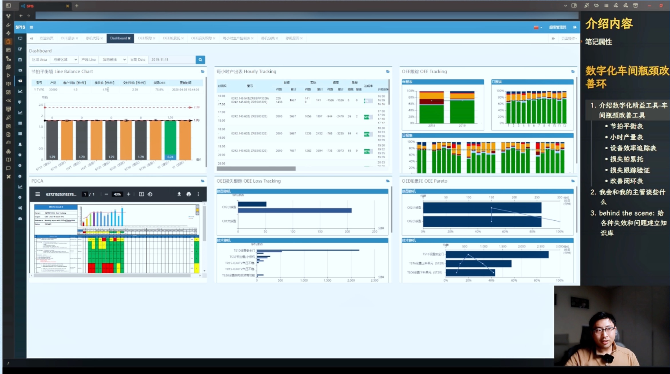
On the screen, you can see that this system consists of six main components.

One of the most critical tools is the line balance chart. This tool helps us understand the standard cycle time, theoretical cycle time, and actual cycle time determined through industrial engineering or other methods for each workstation or production line. With this data, we can clearly see our production capacity and the foundation of our scheduling—how much we can produce and what our delivery cylce time is.
For example, if we find that the actual cycle time is 1.79 seconds, while the customer demand cycle time is 2.39 seconds, it is evident that our production line is running faster than required, indicating additional production potential.
Next, the Hourly Output Chart helps us track discrepancies between theoretical and actual output in real-time using manually or automatically collected data, allowing us to manage deviations effectively.
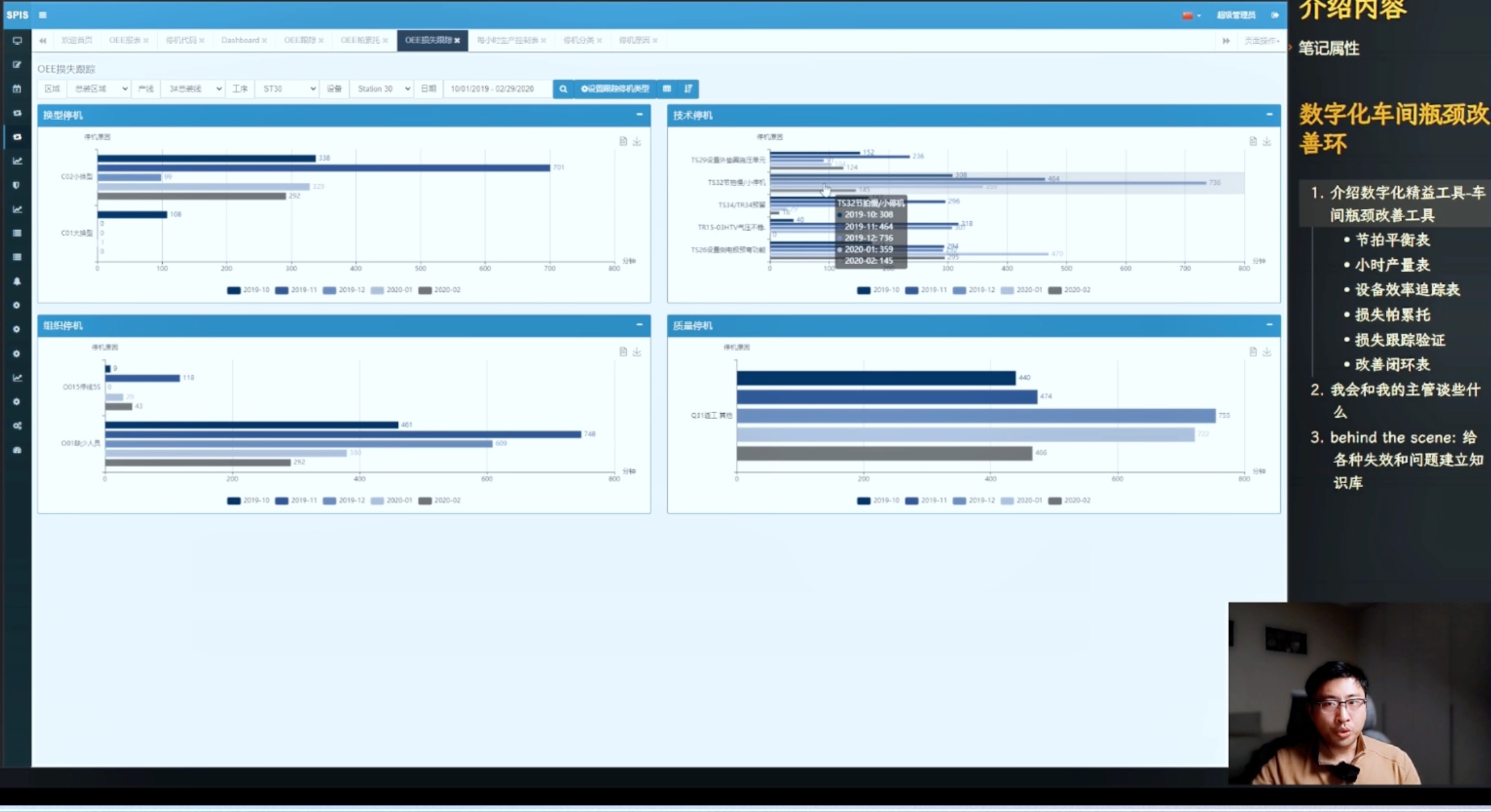
Using this data, we can track equipment efficiency through Overall Equipment Effectiveness (OEE) and further analyze daily, monthly, and yearly OEE trends using the OEE Loss Tracking Table, breaking down different loss categories.
Based on this analysis, the OEE Loss Analysis Pareto Chart helps identify the primary loss categories affecting OEE and further break them down into specific improvement measures.
Each improvement’s effectiveness is tracked and validated using the PDCA Improvement Loop Table, which provides a visual representation to ensure the success of every corrective action.
By integrating lean methodologies into a standardized process, we condense management thinking into a systematic framework. In practical applications and talent development, this method significantly improves efficiency. Instead of reinventing the wheel, everyone can use a unified approach to solve real-world problems efficiently. For businesses, concentrating efforts on solving key issues is absolutely essential.
2. From Problem to Solution—How Production Managers Utilize Digital Tools to Ask the Right Questions
As production managers, we don’t just analyze data—we use data to guide our supervisory teams in identifying potential issues and developing effective solutions. Let’s dive into a case study to examine these tools in action.
Returning to a previous issue—do you remember the problem on the 25th? Both Line 2 and Line 3 encountered similar problems that day. From a broader perspective, one-time production issues are important, but recurring failures, like those seen on Line 3, are more concerning. Unlike an isolated issue, this is a systemic problem that occurs daily.

With these observations, we engage the supervisory team in on-site discussions to understand their improvement measures and implementation status.
Standing in front of the large screen, instead of explaining in detail as I am now, I reduce my speaking time and focus on asking questions:
• “Supervisor, how are things going lately?”
• “Which production line is causing you the most trouble right now?”
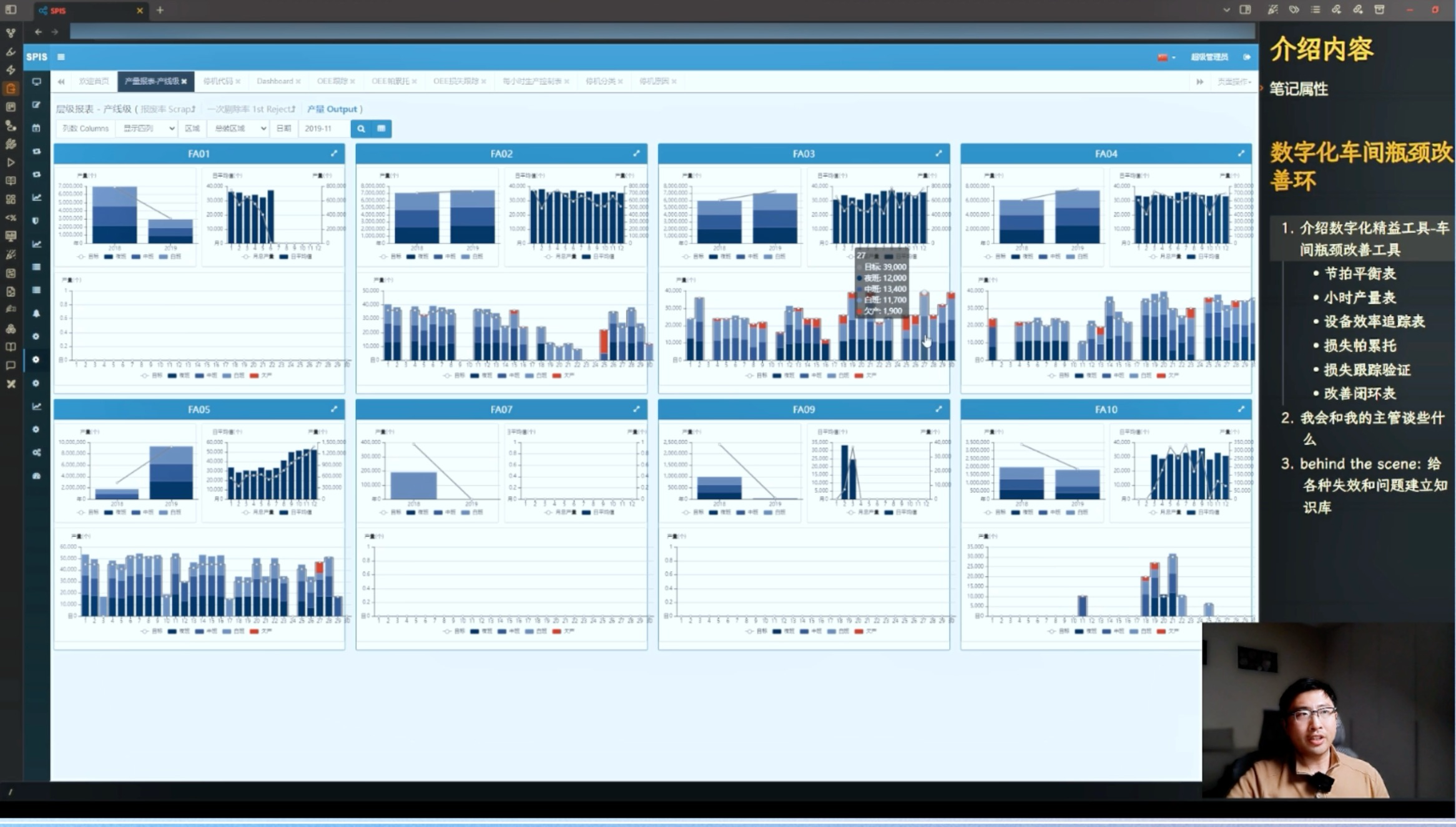
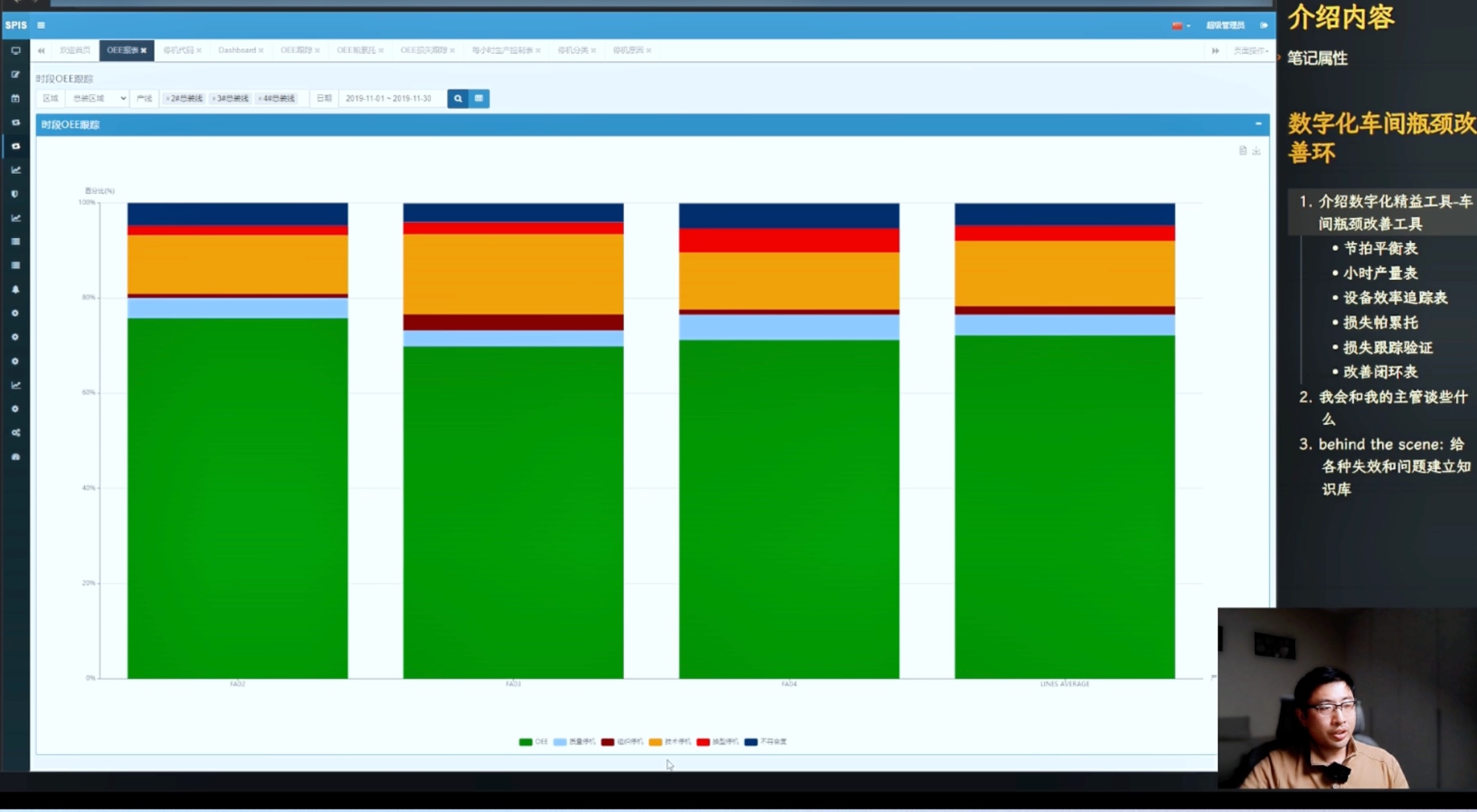
These questions often lead the discussion toward Line 3. On the screen, we have a section called SMC, which represents the Digital Shopfloor Management Cycle. Clicking on it, I open the OEE Report and select data from three assembly lines for comparison.
Looking at November’s data, we confirm that Line 3 has the worst performance. The bar chart shows that technical downtime accounts for the most significant loss, making it the primary cause of total downtime.

Why is this happening?
With this question in mind, we examine key insights on the dashboard.
From the production cycle data, I ask:
• “What’s the current OEE situation?”
The supervisor usually checks the OEE tracking table, which reveals several days of poor performance.
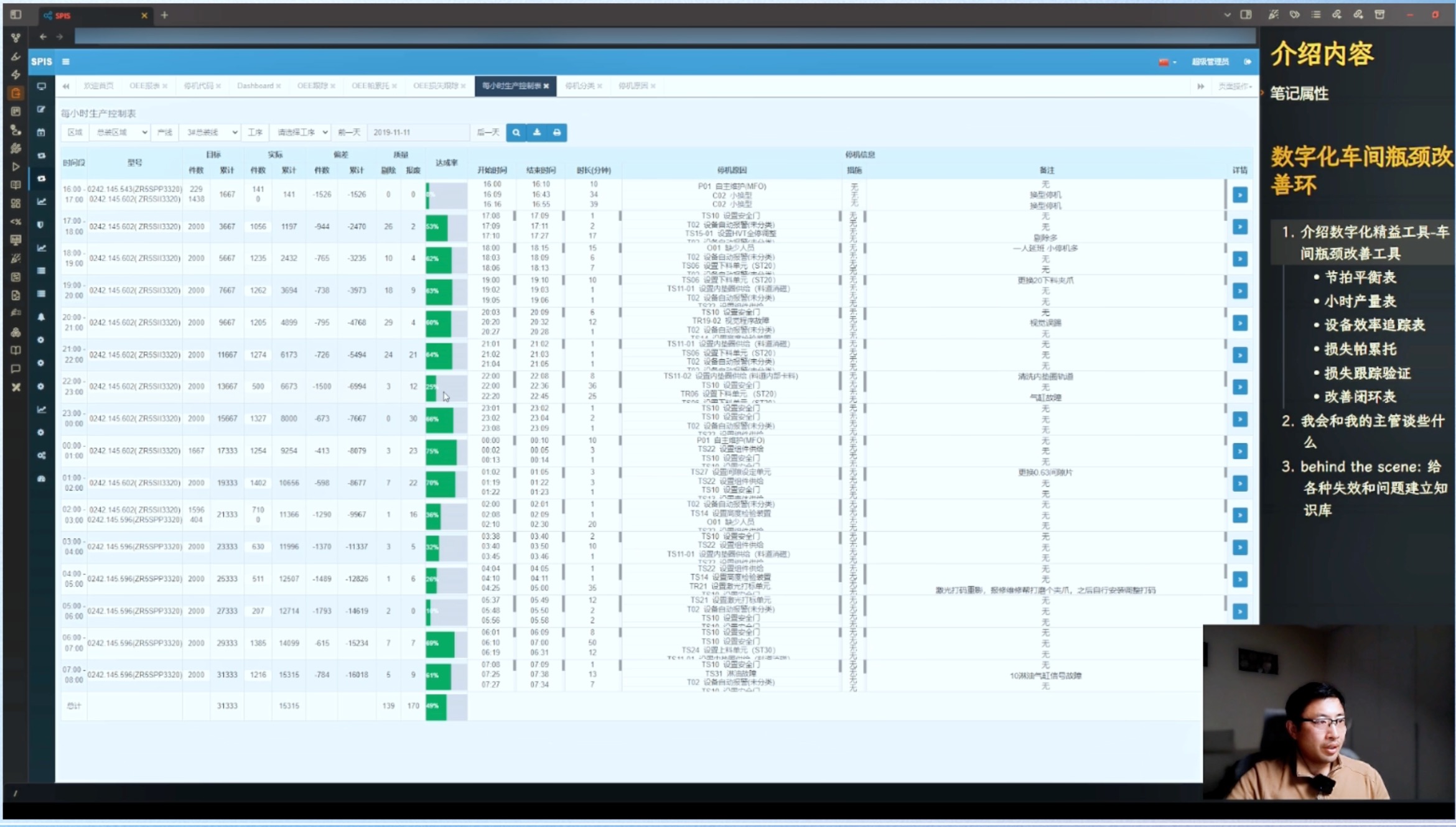
For example, looking at November 11, we notice significant underperformance.

Clicking on that day’s data, we discover:
• A small changeover caused nearly an hour of lost production.
• Additional downtime was due to component supply issues and electric ring supply alarms, leading to production halts.
Beyond these data points, we also reference the Pareto Analysis, which identifies slow cycle times, small stoppages, minor jams, alarms, unstable air pressure, and electrode pre-bending issues as critical areas of concern.

At this stage, I engage the supervisor:
• “What corrective actions have been implemented?”
• “Do you have specific solutions for these issues, or do you need additional resources?”
With these insights, we return to the tracking table to verify improvements objectively. Previously, without data, a supervisor might claim, “Everything is fine”, and despite skepticism, it was hard to argue. Now, with data, we can quickly validate whether the measures taken in December have effectively addressed November’s problems.
Visualizing Performance Trends
On the screen, we see a color-coded system:
• Green = Target met
• Yellow = Warning
• Red = Underperformance
This visualization makes it clear:
• Production speed is crucial.
• Shop floor meetings occur weekly.
• Action plans are continuously updated.
Recent OEE improvements indicate that our weekly feedback and adjustments are driving real change.
3. The Core Value of the Digital Shopfloor Management Cycle
This high-frequency improvement cycle differs from traditional lean management. Previously, communication relied on paper reports and was monthly, limiting responsiveness. Now, digital lean tools enable weekly—or even more frequent—communication, allowing for real-time tracking and continuous improvement.
With this instant feedback mechanism, production teams can evaluate and refine their actions daily or every few days, dramatically increasing efficiency compared to traditional methods.
Moreover, this real-time feedback creates a gamified experience, where employees immediately see whether their solutions are effective. This engagement significantly boosts motivation and ownership.
A Simple Yet Powerful Approach
At its core, this approach is simple:
1. Dive deep into issues.
2. Facilitate interactive discussions.
3. Help teams find answers.
If answers are unclear, we provide further guidance to ensure full comprehension and action.
By leveraging the Digital Shopfloor Management Cycle, we:
• Rapidly identify bottlenecks.
• Ensure every team action is tracked by data.
• Guarantee that every improvement initiative is effectively executed.
This is the power of digital transformation in shop floor management—turning data into actionable insights that drive real-world production efficiency.
Click the link to watch the full case demonstration video:https://youtu.be/Ey6jPdnDP90
 0510-8521 1230

